| Still Image Virtual Gallery » Print Logos » Close-Up When you've finished viewing the image, close this window to return to the Gallery Thumbnail Window www.rejyna.com rejyna@msn.com |

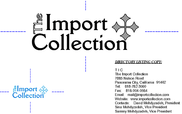
Below is the typical logo treatment used in faxing, email, in-house & forms printing, black & white ads, etc. Rejyna's font fascination & experience goes back to the days of
Prestype, Letraset & burnishing tools. DellaRobbia (PC) or Cantoria (Mac) became the official TIC font and was used on EVERYTHING to ensure consistent corporate identity. Rejyna installed the font(s) on every machine in the
company, concurrent with installing
her custom designed MS Word & Excel templates effectively eliminating outside stationary and letterhead printing costs. The bullet was chosen from an archaic set of symbols to represent a clear eye for design, in the spirit of the
pre-machine eras.


Below is the logo that was being used before Rejyna joined the organization.